Hotel uniform design ideas that still work at the end of a long shift
Five visual directions for hotel uniforms, each tested against real roles, climate, movement, care and continuity before it reaches the shortlist.
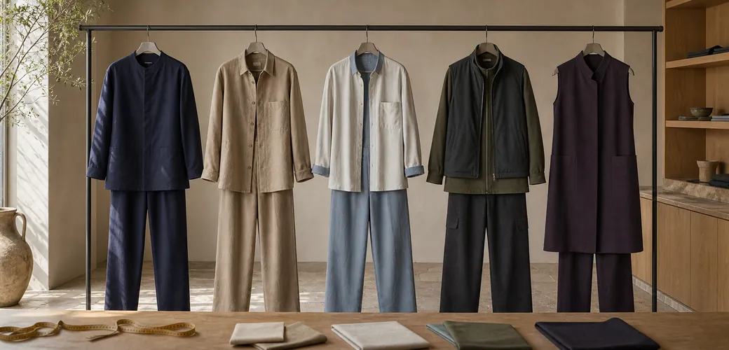
- Translate the hotel’s service mood into palette, silhouette, texture and one controlled signature detail.
- Choose a territory for the property and its roles, not because it looks persuasive on a moodboard.
- Stress-test every direction at arrival, during peak service and after its real care process.
- Shortlist two directions only when both can support movement, climate, role clarity and future reorders.
The strongest hotel uniform design ideas translate a service mood into palette, silhouette, texture and one controlled detail, then prove that combination can survive the shift. Inspiration is useful, but a direction only deserves a shortlist when it works for the property, the role, the climate, the care route and the next reorder.
The moodboard test: attraction is only the first gate
Picture a concept presentation that wins the room: dramatic layers, beautiful fabric and a reference everyone remembers. The reception team then tries the samples and rejects them. Sleeves interrupt repeated desk movements, the layers feel heavy at peak service, and the detail that looked distinctive becomes awkward to clean.
That fictional scene explains the difference between an image and a uniform direction. A moodboard should open a conversation about character, not settle the garment. Before looking at options, write down the service mood in usable terms such as precise, warm, relaxed, protective or ceremonial. Those words can guide design decisions without turning the team into part of the décor.
Research by Tu and colleagues found relationships between uniform styles, employee job satisfaction and customers’ perceptions of employee performance. The study does not tell a hotel which style to choose or prove that a look creates a business result. It does reinforce why the wearer and the guest both belong in the decision.
Quiet precision: tonal, clear and controlled
Quiet precision uses a narrow palette, clean lines and details that reveal themselves at close range. Think deep navy, mineral grey, soft taupe or warm black; straight trousers; a collarless jacket or refined overshirt; and one considered closure or edge finish. Matte fabrics and restrained contrast keep the direction composed rather than corporate.
This territory suits a city hotel or a property whose service is discreet and exact. It can connect reception, concierge and food-and-beverage roles through proportion and colour while changing pocket placement, layering and structure for each job.
Its failure risk is severity. Too much dark tailoring, too little texture or a rigid silhouette can create distance and make movement feel formal. Test the direction in conversation, seated work and repeated reaching. If the team appears guarded rather than attentive, soften the fabric, open the neckline or relax one layer instead of adding decoration.
Residential warmth: familiar layers with restraint
Residential warmth borrows the ease of a well-composed home, not the literal look of domestic clothing. A palette of oat, clay, tobacco, moss or softened blue can sit across knitted polos, relaxed shirts, chore-inspired jackets and fluid trousers. Tactile surfaces do much of the visual work, so the signature detail can remain small: a shaped pocket, a contrast facing or a warm-toned fastening.
This direction fits a boutique hotel, extended-stay property or intimate resort where the service should feel personal and unforced. The silhouettes can remain welcoming while role clarity comes from the degree of structure: a sharper reception layer, an easier restaurant shirt and a more functional housekeeping garment within the same colour family.
The risk is care complexity. Softness on a material board can become creasing, surface wear or an inconsistent appearance across shifts. Confirm how each texture responds to the actual cleaning route, and never assume that a tactile fabric is operationally suitable because it looks natural. Warmth should come from proportion and colour as much as from delicate materials.
Coastal ease and alpine layering: climate becomes a rule
Coastal ease starts with air, movement and glare. Lighter values, open collars, breathable-looking textures and uncluttered silhouettes can support a calm resort mood. The strongest version does not depend on nautical stripes or obvious seaside symbols. It may use chalk, sand, faded blue and olive with a simple overshirt, generous trouser line and one crisp detail to retain authority.
Alpine layering answers the opposite problem: changing temperatures, indoor-to-outdoor movement and the need to add or remove warmth without losing the wardrobe’s identity. A base shirt, fine-gauge middle layer and clean outer garment can share colour and closure logic. Earth tones, deep green, charcoal and muted burgundy can suggest shelter without copying traditional dress.
Both directions can fail through costume. Coastal ease may become holiday clothing with too little role clarity; alpine references may turn into theme dressing. Use climate as the design rule and local culture as a subtle cue, never as a collection of symbols. Every layer should have a clear temperature, movement or service purpose.
Modern ceremony: hierarchy without stiffness
Modern ceremony gives arrival and formal service a visible sense of occasion. A longer line, a framed neckline, a controlled wrap, a sculpted waistcoat or a distinctive but quiet button placement can mark the moment. Rich, restrained colours such as ink, aubergine, bronze or forest work best when the silhouette remains simple.
This territory can suit a grand entrance, evening service or a property with deliberate rituals. It does not require every role to wear the same level of formality. One ceremonial element can sit with reception or door teams while related colours and proportions connect less formal departments.
The risk is restriction. A dramatic line can interfere with stairs, luggage, tray service, sitting or fast changes of direction. It can also turn role hierarchy into visual distance. Ask what the detail helps communicate, then remove it if its only purpose is spectacle. Ceremony works when the wearer can still act naturally.
Put every idea through three real scenes
A direction should face the same test regardless of style. First, place it at arrival: can a guest identify the team, and does the wardrobe match the service tone without copying the interior? Second, place it at peak shift: can each role bend, reach, carry, sit, layer and manage its real tools? Third, place it after the actual care process: does the concept still read clearly when garments have been cleaned, pressed, issued and combined by different people?
The PAMUUC hospitality case study shows how spatial references, role differences and operational requirements can meet in one wardrobe. It is a project example, not a visual template. For the full method behind space, roles and operations, use the companion guide on how to design hotel uniforms.
- Arrival: identity, approachability, role recognition and first impression
- Peak shift: movement, tools, temperature, layering and wearer confidence
- After care: appearance, combination, pressing, replacement and repeatability
Shortlist two directions, not twenty images
Reduce the moodboard to two coherent territories and describe each in the same language. Define its palette, silhouette, texture, signature detail, suitable roles and principal failure risk. Then ask whether it belongs to this property, supports the work, responds to the climate, fits the care route and can remain coherent when new garments are ordered.
Do not merge every attractive reference into one overloaded answer. Two distinct directions give the hotel enough contrast to make a real decision while preserving room for prototypes and wearer feedback. If neither survives the three scenes, return to the service mood rather than searching for more images.
Bring the hotel’s interior deck and role list to a concept review. PAMUUC can test the two directions against real garments, operations and continuity before development begins. See the design process or request an introductory meeting when the shortlist is ready.
Related reading
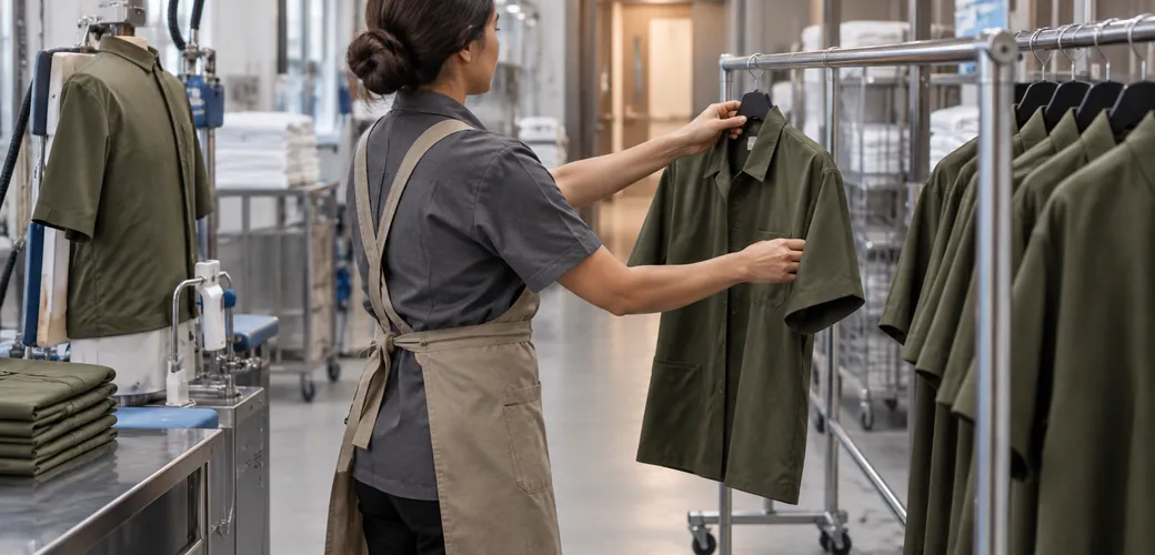
Hotel uniform laundry requirements
Map collection, sorting, washing, drying, finishing and return so hotel, laundry and supplier can approve one compatible uniform process.
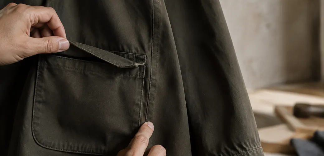
Hotel uniform durability diagnosis
Diagnose fading, shrinkage, abrasion, seam damage and failed trims, then correct the specification behind premature hotel uniform failure.
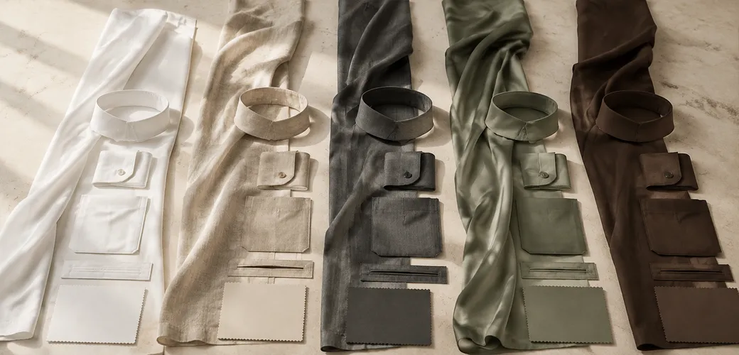
How to compare hotel uniform fabric samples
Use a practical scorecard to compare shortlisted hotel uniform fabric samples by appearance, movement, care evidence and finished garment testing.
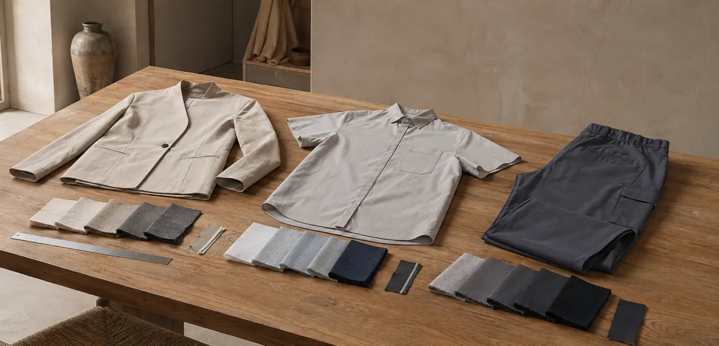
Hotel uniform fabric guide
A role-led guide for turning hotel laundry, climate, movement and appearance needs into a fabric brief suppliers can answer with evidence.
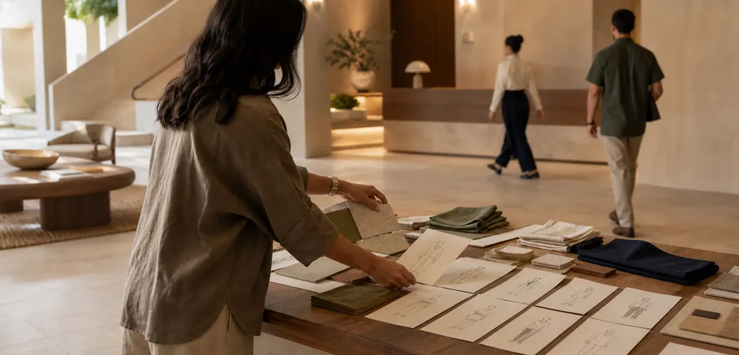
How to design hotel uniforms
A practical method for turning a hotel concept, team roles and operational needs into one coherent, supplier-ready uniform brief.
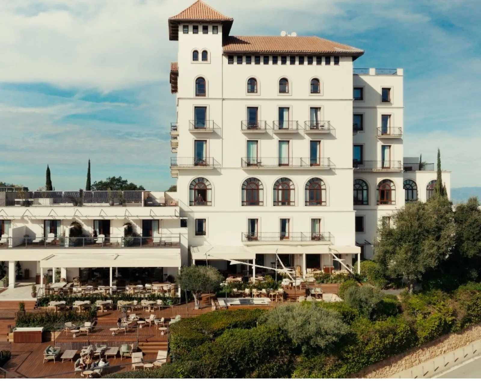
Custom hotel uniforms: design & durability
Discover how we designed bespoke uniforms for a five-star hotel in Barcelona, in line with the interior concept, using durable fabrics built for daily service.
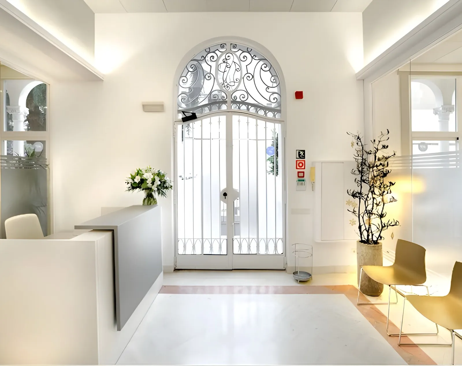
Custom uniforms for dental clinics
A case study on how a premium dental clinic in Barcelona used custom uniforms to bring together space, brand image, and everyday use.
Uniforms for wellness studios
How to build a uniform system for wellness studio teams by aligning space, comfort, daily service, and fabric durability.